Chapter 2: Q. 77 (page 144)
Often, cruise ships conduct all on-board transactions, with the exception of gambling, on a cashless basis. At the end of the cruise, guests pay one bill that covers all onboard transactions. Suppose that single travelers andcouples were
surveyed as to their on-board bills for a seven-day cruise from Los Angeles to the Mexican Riviera. Following is a summary of the bills for each group.
a. Fill in the relative frequency for each group.
b. Construct a histogram for the singles group. Scale the -axis by widths. Use relative frequency on the -axis.
c. Construct a histogram for the couples group. Scale the -axis by widths. Use relative frequency on the -axis.
d. Compare the two graphs:
i. List two similarities between the graphs.
ii. List two differences between the graphs. iii. Overall, are the graphs more similar or different?
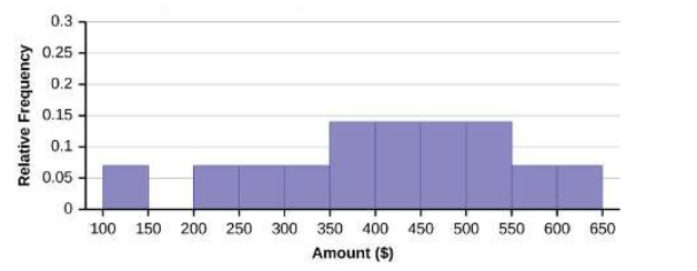
e. Construct a new graph for the couples by hand. Since each couple is paying for two individuals, instead of scaling the -axis by , scale it by . Use relative frequency on the -axis.
f. Compare the graph for the singles with the new graph for the couples:
i. List two similarities between the graphs.
ii. Overall, are the graphs more similar or different?
g. How did scaling the couples graph differently change the way you compared it to the singles graph?
h. Based on the graphs, do you think that individuals spend the same amount, more or less, as singles as they do person by person as a couple? Explain why in one or two complete sentences.
Short Answer
a. relative frequency
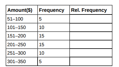
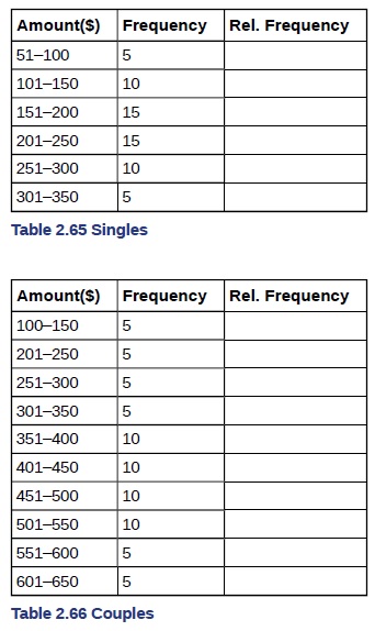
Singles:
| Amount($) | Frequency | Relative Frequency |
|---|---|---|
| 51–100 | 5 | 0.08 |
| 101–150 | 10 | 0.17 |
| 151–200 | 15 | 0.25 |
| 201–250 | 15 | 0.25 |
| 251–300 | 10 | 0.17 |
| 301–350 | 5 | 0.08 |
Couples:
| Amount($) | Frequency | Relative Frequency |
|---|---|---|
| 100–150 | 5 | 0.07 |
| 201–250 | 5 | 0.07 |
| 251–300 | 5 | 0.07 |
| 301–350 | 5 | 0.07 |
| 351–400 | 10 | 0.14 |
| 401–450 | 10 | 0.14 |
| 451–500 | 10 | 0.14 |
| 501–550 | 10 | 0.14 |
| 551–600 | 5 | 0.07 |
| 601–650 | 5 | 0.07 |
b. Histogram
c. Histogram
d. Answers may vary. Possible answers include: The graphs are more similar than different because the overall patterns for the graphs are the same.
e. Check student's solution.
f. Answers may vary. Possible answers include: Although the width of the class intervals for couples is double that of the class intervals for singles, the graphs are more similar than they are different.
g. Answers may vary. Possible answers include: You are able to compare the graphs interval by interval. It is easier to compare the overall patterns with the new scale on the Couples graph.
h. Answers may vary. Possible answers include: Based on the histograms, it seems that spending does not vary much from singles to individuals who are part of a couple. The overall patterns are the same.
Step by step solution
Given information
Cruise ships conduct all on-board transactions, with the exception of gambling, on a cashless basis.
Part (a) Step 1: Explanation
The relative frequency for singles and couples are given as follows:
Singles:
| Amount($) | Frequency | Relative Frequency |
|---|---|---|
| 51–100 | 5 | 0.08 |
| 101–150 | 10 | 0.17 |
| 151–200 | 15 | 0.25 |
| 201–250 | 15 | 0.25 |
| 251–300 | 10 | 0.17 |
| 301–350 | 5 | 0.08 |
Couples:
| Amount($) | Frequency | Relative Frequency |
|---|---|---|
| 100–150 | 5 | 0.07 |
| 201–250 | 5 | 0.07 |
| 251–300 | 5 | 0.07 |
| 301–350 | 5 | 0.07 |
| 351–400 | 10 | 0.14 |
| 401–450 | 10 | 0.14 |
| 451–500 | 10 | 0.14 |
| 501–550 | 10 | 0.14 |
| 551–600 | 5 | 0.07 |
| 601–650 | 5 | 0.07 |
Part (b) Step 1: Explanation
In the following histogram data values that fall on the right boundary are counted in the class interval, while values that fall on the left boundary are not counted (with the exception of the first interval where both boundary values are included).
Part (c) Step 1: Explanation
In the following histogram, the data values that fall on the right boundary are counted in the class interval, while values that fall on the left boundary are not counted (with the exception of the first interval where values on both boundaries are included).
Part (d) Step 1: Explanation
Compare the two graphs:
- Answers may vary. Possible answers include:
- Both graphs have a single peak.
- Both graphs use class intervals with width equal to
- Answers may vary. Possible answers include:
- The couples graph has a class interval with no values.
- It takes almost twice as many class intervals to display the data for couples.
- Answers may vary. Possible answers include: The graphs are more similar than different because the overall patterns for the graphs are the same.
Part (e) Step 1: Explanation
Check student's solution.
Part (f) Step 1: Explanation
Compare the graph for the Singles with the new graph for the Couples:
- Both graphs have a single peak.
- Both graphs display 6 class intervals.
- Both graphs show the same general pattern.
Answers may vary. Possible answers include: Although the width of the class intervals for couples is double that of the class intervals for singles, the graphs are more similar than they are different.
Part (g) Step 1: Explanation
Answers may vary. Possible answers include: You are able to compare the graphs interval by interval. It is easier to compare the overall patterns with the new scale on the Couples graph. Because a couple represents two individuals, the new scale leads to a more accurate comparison.
Part (h) Step 1: Explanation
Answers may vary. Possible answers include: Based on the histograms, it seems that spending does not vary much from singles to individuals who are part of a couple. The overall patterns are the same. The range of spending for couples is approximately double the range for individuals.
Over 30 million students worldwide already upgrade their learning with Vaia!

