A company is analysing the prices at which its items are sold. Graph the relative frequency histogram for the 600 items summarized in the accompanying relative frequency table.

Short Answer

Expert verified

A graph that displays frequencies using vertical columns. And there are no spaces among the bars.

Step by step solution

01

Given information

02

Frequency histogram

A frequency histogram is a graph of a frequency and percentage in which the width, as well as location of rectangles, represent the different classes, as well as the height of those rectangles, represents the regularity with which data fell into the corresponding class. A graph that displays frequencies using vertical columns. And there are no spaces among the bars.

03

Measurement classes

Unlock Step-by-Step Solutions & Ace Your Exams!

  • Full Textbook Solutions

    Get detailed explanations and key concepts

  • Unlimited Al creation

    Al flashcards, explanations, exams and more...

  • Ads-free access

    To over 500 millions flashcards

  • Money-back guarantee

    We refund you if you fail your exam.

Over 30 million students worldwide already upgrade their learning with Vaia!

One App. One Place for Learning.

All the tools & learning materials you need for study success - in one app.

Get started for free

Most popular questions from this chapter

Construct a scatterplot for the data in the following table.

X

.5

1

1.5

y

2

1

3

a. Plot the following two lines on your scatterplot: y = 3 - x and y = 1 + x

b. Which of these lines would you choose to characterize the relationship between x and y? Explain.

c. Show that the sum of the prediction errors for both of these lines equals 0.

d. Which of these lines has the smaller SSE?

e. Determine the data's least-squares line and compare it to the two lines described in part a.

Do the accompanying data provide sufficient evidence that a straight line is useful for characterizing the relationship between x and y?

X424324
Y165324

Best-paid CEOs. Refer to Glassdoor Economic Research firm’s 2015 ranking of the 40 best-paid CEOs in Table 2.1 (p. 65). Recall that data were collected on a CEO’s age and ratio of salary to a typical worker’s pay at the firm. One objective is to predict the ratio of salary to worker pay based on the CEO’s age.

a. In this study, identify the dependent and independent variables.

b. Explain why a probabilistic model is more appropriate than a deterministic model.

c. Write the equation of the straight-line, probabilistic model.

Time in bankruptcy. Financially distressed firms can gain protection from their creditors while they restructure by filing for protection under U.S. Bankruptcy Codes. In a prepackaged bankruptcy, a firm negotiates a reorganization plan with its creditors prior to filing for bankruptcy. This can result in a much quicker exit from bankruptcy than traditional bankruptcy filings. A study of 49 prepackaged bankruptcies was published in Financial Management (Spring 1995). For each firm, information was collected on the time (in months) in bankruptcy as well as the results of the board of directors’ vote on the type of reorganization plan. Three types of plans were studied: “Joint”—a joint exchange offer with prepackaged bankruptcy solicitation; “Prepack”—prepackaged bankruptcy solicitation only; and “None”—no pre-filing vote held. The data for the 49 firms is provided in the accompanying table
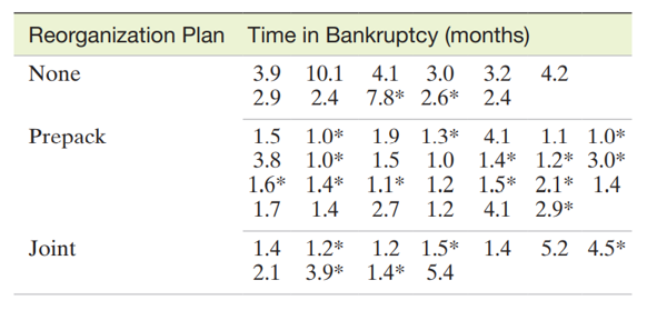
a. Construct a stem-and-leaf display for the length of time in bankruptcy for all 49 companies.

b. Summarize the information reflected in the stem-and-leaf display from part a. Make a general statement about the length of time in bankruptcy for firms using “prepacks.”

c. Select a graphical method that will permit a comparison of the time-in-bankruptcy distributions for the three types or reorganization plans.

d. Firms that were reorganized through a leveraged buyout are identified by an asterisk in the table. Mark these firms on the stem-and-leaf display, part a, by circling their bankruptcy times. Do you observe any pattern in the graph? Explain

Minitab was used to generate the following histogram:

a. Is this a frequency histogram or a relative frequency histogram? Explain.

b. How many measurement classes were used in the construction of this histogram?

c. How many measurements are in the data set described by this histogram?

See all solutions

Recommended explanations on Math Textbooks

View all explanations

What do you think about this solution?

We value your feedback to improve our textbook solutions.

Study anywhere. Anytime. Across all devices.

Sign-up for free