Chapter 1: Q 1.3. (page 31)
The Fathom dot-plot displays data on the number of siblings reported by each student in a statistics class.

Describe the spread of the distribution.
Short Answer
The distribution is not approximately normally distributed
Chapter 1: Q 1.3. (page 31)
The Fathom dot-plot displays data on the number of siblings reported by each student in a statistics class.

Describe the spread of the distribution.
The distribution is not approximately normally distributed
All the tools & learning materials you need for study success - in one app.
Get started for free
Comparing car colours Favorite vehicle colours may differ among types of vehicles. Here are data on the most popular colours in for luxury cars and for SUVs, trucks, and vans.

(a) Make a graph to compare colours by vehicle type.
(b) Write a few sentences describing what you see.
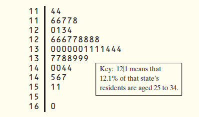
Where do the young live? Below is a stem plot of the percent of residents aged to in each of the states. As in the stem plot for older residents (page 35), the stems are whole percent and the leaves are tenths of a percent. This time, each stem has been split in two, with values having leaves through placed on one stem, and values ending in through placed on another stem.

(a) Why did we split stems?
(b) Utah has the highest percentage of residents aged to . What is that percent? Why do you think Utah has an unusually high percentage of residents in this age group?
(c) Describe the shape, center, and spread of the distribution, ignoring Utah.
Medical study variables Data from a medical study contain values of many variables for each of the people who were the subjects of the study. Here are some of the variables recorded: gender (female or male) age (years) race (Asian, black, white, or other); smoker (yes or no) systolic blood pressure (millimetres of mercury) level of calcium in the blood (micrograms per millilitre).
Identify each as categorical or quantitative.
You are interested in how much time students spend on the Internet each day. Here are data on the time spent on the Internet (in minutes) for a particular day reported by a random sample of 30 students at a large high school

(a) Construct a histogram of these data. (b) Are there any outliers? Justify your answer. (c) Would it be better to use the mean and standard deviation or the median and )12 to describe the center and spread of this distribution? Why?
One of the following scores was omitted from the stem plot below:

The missing number is
What do you think about this solution?
We value your feedback to improve our textbook solutions.