Facebook and age Use the data in the previous exercise to determine whether there is an association between Facebook use and age. Give appropriate graphical and numerical evidence to support your answer.

  • Make a dot-plot or stem plot to display small sets of data.
  • Describe the overall pattern (shape, center, spread) of distribution, and identify any major departures from the pattern (like outliers).

Short Answer

Expert verified

There exist some association between Facebook users and age.

Step by step solution

01

Given information

Age and Facebook Use the information from the last exercise to see if there is a link between Facebook usage and age.

02

Concept

A statistical graph or chart is a visual representation of statistical data in graphical form.

03

Calculation

Calculate the percentages for each type of student to learn about the relationship between Facebook users and age. The percentages are presented in the table below.


Facebook user
AgeYesNo
Younger7282×100=95.12%
482×100=4.88%
Middle
4970×100=70%
2170×100=30%
Older2167×100=31.34%
4667×100=68.66%

As can be seen from the table above, the number of users reduces as the user's age rises. As a result, there is a link between Facebook users and their age. Now, using MINITAB, create a graph using the problem's given table as shown below.
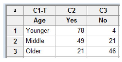
To begin, enter all of the data into MINITAB. The screenshot is as follows.

Select the bar chart option from the dropdown menu after clicking on the Graph menu. A new dialogue box will appear after that. Select the values from a table option first, then the cluster choice under the two-way table option, and then click the OK button. Below is an example of a screenshot.

A new dialogue box will appear after that. Select yes and no responses in the graph variable choice, age in the row label option, and lastly, rows are outermost categories and columns are innermost in the row label option. Below is an example of a screenshot. Finally, press the OK button to get the desired graph of the entire procedure. Below is a graph of the data.

After that, a new dialogue box will display. In the graph variable option, choose yes or no replies, age in the row label option, and finally, rows are the outermost categories and columns are the innermost in the row label option. An example of a screenshot is shown below. Finally, press the OK button to obtain the desired method graph. A graph of the data is shown below. Therefore, there exists some association between Facebook users and age.

Unlock Step-by-Step Solutions & Ace Your Exams!

  • Full Textbook Solutions

    Get detailed explanations and key concepts

  • Unlimited Al creation

    Al flashcards, explanations, exams and more...

  • Ads-free access

    To over 500 millions flashcards

  • Money-back guarantee

    We refund you if you fail your exam.

Over 30 million students worldwide already upgrade their learning with Vaia!

One App. One Place for Learning.

All the tools & learning materials you need for study success - in one app.

Get started for free

Most popular questions from this chapter

Here, once again, is the stem plot of travel times to work for 20randomly selected New Yorkers. Earlier, we found that the median was 22.5minutes.

Interpret your result from Question 2 in context without using the words “mean” or “average".

The histogram below shows the distribution of the percent of women aged 15 and over who have never married in each of the 50 states and the District of Columbia.

In about what percent of states have at least 30% of women aged 15 and over never married?

(a) 4%(b) 7%(c)10%(d) 14%(e) 32%

Earthquake intensities are measured using a device called a seismograph, which is designed to be most sensitive to earthquakes with intensities between 4.0 and 9.0 the Richter scale. Measurements of nine earthquakes gave the following readings:

where L indicates that the earthquake had an intensity below 4.0 and an H indicates that the earthquake had an intensity above 9.0. The median earthquake intensity of the sample is (a) 5.75. (c) 6.47. (e) Cannot be determined. (b) 6.00. (d) 8.70.

Attitudes toward recycled products Recycling is supposed to save resources. Some people think recycled products are lower in quality than other products, a fact that makes recycling less practical. People who actually use a recycled product may have different opinions from those who don’t use it. Here are data on attitudes toward coffee filters made of recycled paper among people who do and don’t buy these filters:

(a)How many people does this table describe? How many of these were buyers of coffee filters made of recycled paper?

(b)Give the marginal distribution of opinion about the quality of recycled filters. What percent of consumers think the quality of the recycled product is the same or higher than the quality of other filters?

Popular colours—here and there Favorite vehicle colours may differ among countries. The side-by-sidebar graph shows data on the most popular colours of cars in 2008 for the United States and Europe. Write a few sentences comparing the two distributions.

See all solutions

Recommended explanations on Math Textbooks

View all explanations

What do you think about this solution?

We value your feedback to improve our textbook solutions.

Study anywhere. Anytime. Across all devices.

Sign-up for free