Which major? About 3 million first-year students enroll in colleges and universities each year. What do they plan to study? The pie chart displays data on the percent of first-year students who plan to major in several disciplines. About what percent of first-year students plan to major in business? In social science?

Short Answer

Expert verified

Business around 20% and social science around 10%.

Step by step solution

01

Step 1. Given information.

The given Pie chart is:

02

Step 2. Find what percentage of first-year students intend to study business and What about social science.

If we observe the given pie chart carefully after dividing this pie chart into quarters and then further dividing these quarters into subparts, we will find that around one-fifth of the area of the circle constitutes the business segment.

That means around 20%:

15×100=20%

And that around one-tenth of the area of the circle constitutes the social science segment.

That means around 10%:

110×100=10%

Unlock Step-by-Step Solutions & Ace Your Exams!

  • Full Textbook Solutions

    Get detailed explanations and key concepts

  • Unlimited Al creation

    Al flashcards, explanations, exams and more...

  • Ads-free access

    To over 500 millions flashcards

  • Money-back guarantee

    We refund you if you fail your exam.

Over 30 million students worldwide already upgrade their learning with Vaia!

One App. One Place for Learning.

All the tools & learning materials you need for study success - in one app.

Get started for free

Most popular questions from this chapter

Simpson’s paradoxAccident victims are sometimes taken by helicopter from the accident scene to a hospital. Helicopters save time. Do they also save lives? The two-way table summarizes data from a sample of patients who were transported to the hospital by helicopter or by ambulance.

(a) What percent of patients died with each method of transport? Here are the same data broken down by severity of accident:
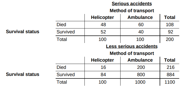
(b) Calculate the percent of patients who died with each method of transport for the serious accidents. Then calculate the percent of patients who died with each method of transport for the less serious accidents. What do you notice?

(c) See if you can explain how the result in part (a) is possible given the result in part (b).

Note: This is an example of Simpson’s paradox, which states that an association between two variables that holds for each value of a third variable can be changed or even reversed when the data for all values of the third variable are combined.

Superpower Refer to Exercise 24.

(a) What proportion of students in the sample who prefer invisibility as their superpower are from the United States?

(b) What percent of students in the sample who are from the United Kingdom prefer superstrength as their superpower?

Cool car colors The most popular colors for cars and light trucks change over time. Silver advanced past green in 2000 to become the most popular color worldwide, then gave way to shades of white in 2007. Here is a relative frequency table that summarizes data on the colors of vehicles sold worldwide in a recent year.

(a) What percent of vehicles would fall in the “Other” category?

(b) Make a bar graph to display the data. Describe what you see.

(c) Would it be appropriate to make a pie chart of these data? Explain.

Carbon dioxide emissions Burning fuels in power plants and motor vehicles emits carbon dioxide (CO2 ), which contributes to global warming. The table displays CO2 emissions per person from countries with populations of at least 20 million. 30

Part (a). Make a histogram of the data using intervals of width 2, starting at 0.

Part (b). Describe the shape of the distribution. Which countries appear to be outliers

Python eggsRefer to Exercise 26.

(a) Of the eggs that hatched, what proportion were randomly assigned to hot water?

(b) Of the eggs that were randomly assigned to hot water, what percent hatched?

(c) The segmented bar graph displays the distribution of hatching status by water temperature. Describe what this graph reveals about the association between these two variables for the python eggs in this experiment.

See all solutions

Recommended explanations on Math Textbooks

View all explanations

What do you think about this solution?

We value your feedback to improve our textbook solutions.

Study anywhere. Anytime. Across all devices.

Sign-up for free